果然如傳聞的那樣,在今晨的 Google I/O 2015 上,Google 一上來就端出了最多人關心的新版行動系統:Android M(現在還不知道 M 代表的到底是什麼...)。雖然在現場官方介紹的只是開發者預覽,但從中我們還是可以掌握一些新版本的發展方向。和 Lollipop 巨大的變化相比(尤其是視覺上),M 更注重對 Android 體驗細節的雕琢。「在 M 中我們回歸了根本。」Google 高級副總裁 Sundar Pichai 這樣說道,「我們這次更注重打磨和品質,到目前為止已經解決了無數的問題。」 Android M preview at Google I/O
首先,關於應用權限管理的流言在今天得到了證實,在 Android M 中,你無須在安裝應用時對權限進行選擇,之後運行應用真正需要用到某項權限的時候,系統才會詢問你是否同意(就好像 iOS 那樣,不過只需設定一次)。這無疑比之前的做法更加清楚,用戶可以更具體地了解到手機上的應用在做些什麼。
與此同時,Android M 還透過 Chrome 客製分頁(Custom Tabs)提升了在應用中瀏覽網頁的體驗。以 Pinterest 為例,在使用這項功能以後,只要在應用內點擊連結便會迅速跳出一個網頁視窗。簡單來說,Google 希望開發者們能將應用內網頁瀏覽的體驗做到像應用本身那麼好,而且他們這次把應用間的互動做成了 Android M 的一項核心功能。想像一下,每次跳轉都是直接進到一個特定的頁面,而不是先到主介面,再一步一步手動去選擇。
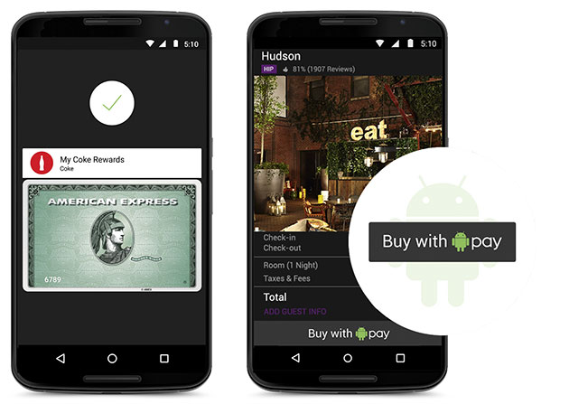
接下來,是今年早些時候發表的行動支付平台Android Pay。在 Android M 中它會扮演很重要的角色,讓使用者可以透過手機上的 NFC 更安全地完成支付。說更安全是因為和傳統的信用卡相比,Android Pay 每筆交易都會創建一個不同的虛擬卡號,這樣一來,資訊外洩的風險日然而言就降低了不少。值得一提的是,Google 在 Android M 中也確立了統一的指紋辨識標準,它可以用來進行實際或虛擬支付,當然,解鎖手機更是小菜一碟了。
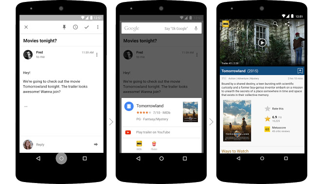
另外,在 Android M 中 Google Now 也會升級為全新的 Now on Tap,它能為使用者提供更多搜尋關鍵字的額外資訊,不用離開應用或是網頁,你就可以找到營業時間、電影評分等內容了。而且最關鍵的是,Now on Tap 在傳訊、通話等過程中都可以方便使用,比如說在好友來電約看電影的同時,你就可以長按 Home 鍵來查看評價、買電影票或是欣賞預告片了。
最後,Android M 在電池續航力上也有了一些改進。全新的 Doze 功能可以讓你的裝置利用感應器來確定其是否在被使用,如果它處於空閒狀態的話,節能狀態便會被啟動。按照 Google 的說法,使用 Doze 的 Nexus 9 測試機續航時間直接多了一倍,寫到這裡,真是好奇它能給手機帶來多大的幫助啊。此外,Android M 也支援最新的 USB Type-C 連接埠,快速 / 雙向充電估計會越來越多地出現在行動產品之上。
總的來說,Android M 的確像 Sundar Pichai 所言那樣,是一版更偏重「打磨和品質」的系統。在它身上你可以看到許多從 iOS 那裡「學」來的東西,比如權限管理,比如行動支付... 但這其實並不是一件壞事,在不同平台上都能有功能齊全的使用感受,至少對用戶來說應該是樂於見到的吧。從今天開始,開發者就可以在 Nexus 5、6、9 以及 Player 機頂盒上體驗到 Android M 的搶先預覽版,正式版本的上線日期目前還沒有確定。
Google 開發的下一代 Android M 系統中將會有統一的指紋保安認證標準,讓各家廠商不用多花資源去開發自家的。新的標準同時也代表第三方開發者能藉此為 Android 裝置解鎖、以 Google Pay 付款和其他需要指紋資料的功能。新系統將會包含所需的 API,讓開發者把其整合至應用程式之中,就像 Apple 為 Touch ID 所做的。
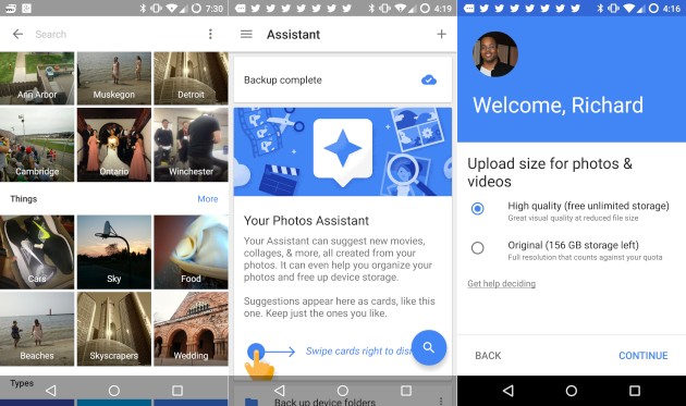
Photos 有一個很讓人喜歡的功能,是可以為每張照片建立一個可以分享的連結(Twitter、Facebook 之類的就是小菜一碟)。這樣一來當你決定「收回」已經對外發出的照片時,就不用專門去刪除對應的檔案了。此外,在 Photos 中你還能找到一個類似 Google Now 的「助理(Assistant)」,它會隨時給你提供卡片建議,詢問你是否需要拼圖或創建新的相片集。
前面也說了,Photos 身上還是有很多 Google+ 的影子,像是 Auto Awesome(自動美化)之類的功能,都被很好地繼承了下來。話雖如此,把照片編輯、儲存服務獨立化仍是很符合邏輯的做法,不再限於 Google+ 這一個平台,就更容易吸引到使用不同社交服務的用戶。
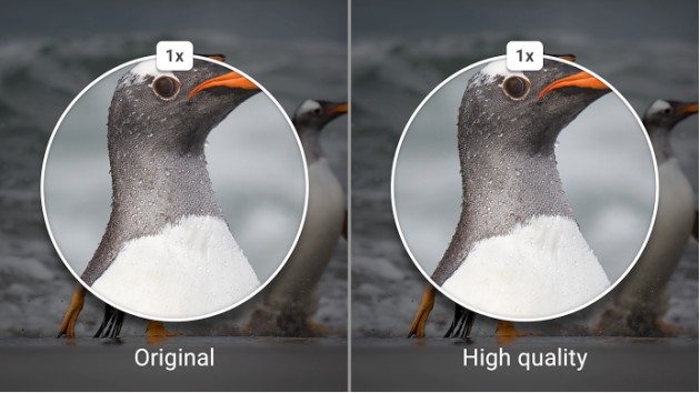
在啟動 Photos 的時候,你仍可沿用原來的 Google Drive 服務。而對普通人來說,不限容量模式中 16MP 照片、1080p 影片的限制,其實並不會對日常使用產生很大影響(追求 RAW、TIFF 的朋友還是花錢上 Google Drive 吧)。值得一提的是,Photos 仍會對你儲存的照片進行一定程度的壓縮,但前後畫質上的分別,倒並不顯得十分明顯。當然,Google 會對已經上載的照片進行標識,這樣當你裝置空間吃緊的時候,就可以刪除線下的檔案了。
Google 表示離線功能的支援將會在今年稍晚登場,當然,更新列表正式出現此功能的時候,我們還是會馬上帶來即時報導的!
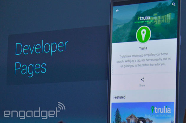
開發者可以先在 Play 商店中試驗定價了
那些關於開發者將可以在 Play 商店中試驗定價的傳聞,果然在今天的 I/O 大會上得到了印證。從現在開始,應用作者在做出最終決定前,都能將軟體的定價、圖示造型放到商店中進行各種嘗試。除此之外,還有上圖中這個專門的開發者頁面,從中可以找到某位開發者的所有應用,對那些具有品牌忠誠度的使用者來說,可謂是非常實用的改進啊。
不错~~~~ Google Chrome to improve browsing with Network Quality Estimator and Offline mode
Addressing Internet speed issues that users in developing markets may be met with, Google will be adding a couple of new features to the Chrome app. In an update that should be rolling out, the browser will now include a couple of handy options.
One of them is Offline browsing – users will be able to save webpages for later viewing, allowing them to access their needed information without the need to have, or waste, any sort of data connection (think bus schedules, cooking recipes, etc.).
The second one helps with the actual browsing when online. Dubbed Network Quality Estimator, this little piece of code will analyze the current data speeds that the user is surfing on and attempt to improve the browsing experience by adjusting the amount of detail the loaded web pages show. Sort of how the current Data Saver option compresses data before downloading it to your phone, but we'd imagine – much more in-depth and automatically adjusted.
Though Google said that the new features are made with developing markets in mind, there is no reason that the new features shouldn't be available internationally. Still, we will have to wait and see.
Here's an up close look at Google Now on Tap
One of the most impressive features announced during Google’s keynote address was Now on Tap. This takes Google Now to a new level in the user experience, and will be part of the update to Android M later this year.
We got to watch a demonstration of Now on Tap up close to see it in action. The demo was pretty much the same as what was presented during the Keynote. However, it is all the better to see it up close.
Now on Tap makes Google Now available without having to leave an app you might be using. More than that, Google Now has contextual access to what you are doing. The result is Google Now linking to more relevant sources, such as movie trailers if you are reading a message to go to the movies, or restaurant reviews if you are corresponding on where to go for dinner.
Our demo worked very smoothly. There was one part where Google Now did not respond, but the device lounge was very loud, and the platform is still being developed, bear that in mind with the video.
What is great about this enhancement is that it will work without any needed work by the app developers, Now on Tap will work across the platform.
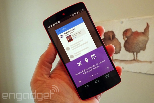
5.0恢复原厂设定过后也可以选择自动下载和安装你还没有格式化之前的软件,但有没有包括app data我就不清楚了 Android M app data auto backup will make device switching less of a hassle
Switching, upgrading, or resetting an Android smartphone is often a daunting task. Not because you will lose your essentials, such as contacts or pictures, no – Google has long taken care of keeping those safely tucked under the cloud's protective cover. But having to reinstall and rearrange all the apps you are using is a chore, to say the least. Well, that little problem may soon be a thing of the past.
Among the many new user experience-enhancing features that Android M is about to bring, there is an Auto Backup for Apps. Much like the name suggests, this should allow apps to save all their data to Google Drive, which should ensure that if a user needs to replace or upgrade their device, their new handset would be restored to a similar condition as the previous one.
The feature will be automatically active for all apps – developers need not worry about updating their software with any additional code. Of course, should the user desire to opt out of auto app backup, the system would allow that.
A neat little touch that was, some would say, long overdue
Google Play improvements mean smarter search, easier parental control
With a billion active users daily, and 50 billion apps served just last month, Google is not about to let the Play Store slip out of control. But how do you ensure that people find the right apps they're looking for? After all, some queries are rather general and vague, at least from a search engine's point of view. Improving on this key aspect of the Play Store has been of priority at Google, or so we were told at I/O 2015 just minutes ago.
The first and more broader improvements that will apply to all Android users have to do with personalization and smarter search. On the first count, the Play Store will actually make sense of your currently installed apps and refine its results based on this information, while on the latter — search results will now be split into categories. So if you search for 'shopping', you'll get a choice between apps that let you buy stuff, and apps that let you get your hands on them for less — like coupons aggregating apps.
Another significant change to the Play Store is aimed at parents. The Play Store will now be much easier for them to navigate and sift through for appropriate content, as apps will be tagged with a special, green 'Family' star to indicate this. Apps for kids will also be available in a 'Family' tab within the Play Store, where parents will be able to further specify their searches with age groups. Moreover, Google is making a ton of different characters that kids love — like the snowman in Frozen, or Dora the Explorer — actual search criteria. So if your kid is crazy about this one particular character, you'll be able to easily get content that features him or her.
In all, while such improvements aren't as sexy as a UI design overhauls or new features, they're nevertheless always welcome. Whether you consider this trivial or not, the Play Store is an integral to the Android experience, and we for one have been wishing for better search algorithms for a while now.
对开发者来说是好消息吧 Google will provide a Cloud Test Lab for developers in an attempt to help them build more stable apps
Google spent some time a the I/O 2015 conference to talk about tools that it will bring developers to help them build better quality apps. Among these is the so called “Cloud Test Lab” - designed to give developers access to more Android devices than they usually would have. The Test Lab will allow an app maker to upload their software to its servers and will then automatically run a series of benchmarks across 20 of the most popular Android handsets. The results will include screenshots and benchmarks, which will be returned to the developer for free.
Obviously, a great tool for app makers, especially since they usually own just one or two different brand smartphones and troubleshooting bugs that appear in other models is often a hard task. 20 smartphone models is definitely not an amazing number, considering the hundreds of different animals that are out there right now, but at least they are the 20 most popular ones (not necessarily flagships), which should mean that the developer should have the tool to bring a stable app to at least most of their users.
The Cloud Test Lab will be coming “soon” whatever that means. Let's just say we wouldn't hold our breath, but it should be some time this year.
Android M: power and charging improved, USB Type-C coming
Android M brings some significant improvements to six key areas: app permissions, web experience, app links, mobile payments, fingerprint support, and power and charging.
The power and charging enhancements are particularly interesting, as we've seen in both our own experience, and in public polls, that better battery life is consistently mentioned as the number one requirement to a smartphone.
Android M brings just that with two new areas of improvement.
#1: Doze Doze is a new deeper state of sleep on Android that will be particularly useful for devices like tablets that spend a lot of time on the shelf, only used when you're at home. What the Android team is doing is actually putting apps to a deeper state of sleep, so that they are slower to wake up, but given that you use the device rarely (say, only at night), the tradeoff is worth it.
In fact, Google claims that it has achieved an improvement of up two 2x of standby battery life on the Nexus 5(it tested two Nexus 9 tablets, both loaded up with a bunch of apps, but one running on Android L, and the other - running on Android M with Doze).
Keep in mind that Doze in Android M brings improvement only to deep sleep for devices that are rarely used, so the benefit to smartphones won't be all that well pronounced (some improvements can still be expected). At the same time, Google has also made sure not to break essential functionality so that you can still hear your alarms and get messages from people you care about.
#2: USB Type-C
The other key area of improvement is related to the upcoming USB Type-C connector that is set to eclipse the current microUSB slot that phones and tablets use to charge and sync. With Android M, Google is getting ready for that transition, so that phones can indeed charge up quicker.
Not only that, with Android M, you'd now be able to use your phone to charge other devices. Imagine having a smartwatch that has a tiny battery that's running out quickly - you can use your phone to charge up the timepiece.
Finally! Android M scores a new, system-wide dark UI theme
Guess what, Android fans? Google has most probably kept an ear close to the ground, as the next Android rendition will bring a feature requested by many a user - a dark theme for the UI.
Hidden deep in the Developer options menu is a feature that allows you to choose between two UI themes - light and dark. Hooray, users of phones with AMOLED displays, your wish has been granted!
Apart from the two themes, users can also opt for an automatic mode that will most likely switch between the light and the dark themes according to the time of day or another variable, probably.
At this point, Android M doesn't come with many new visual changes, but the new UI theme is a newcomer that will certainly appeal to many, many Android fans.
Latest Android Wear release brings useful user experience enhancements in the wake of Apple Watch release
Always on apps can show you your list of groceries at all times
After talking a bit about Android M, Google dedicated some time time to Android Wear on its Google I/O conference. Android Wear was praised for the amount of choice it offers to customers – from the numerous different devices, made by Google's partners, to the 1,500 watch faces that are currently up on the Play Store. A new version of Wear should be hitting smartwatches in a few weeks, and it will bring a few user experience improvements.
The new update aims at making the smartwatch glanceable, actionable, and, more importantly, to make it a device that you don't need both hands to operate. This is most obvious with the new gesture controls – the user will no longer need to swipe through notification cards with their finger. Instead, just tilting the smartwatch in one direction will cycle through the cards in that way. Wave your wrist the other way and you go back to the previous card.
Another nifty little feature is the "always on apps" screen. Up until now, Android Wear watches could have an always on screen, which shows time in monochrome black and white colors, conserving battery while still retaining its "watch" appearance. After the next update, users will be able to have the same monochrome view of any app they choose. For example, you can enter the store with a grocery checklist loaded on the watch. Let the display dim out to black and you will get a battery-saving, black-and-white version of that list. Or load up a route in Google Maps and get glanceable navigation without draining too much of the wearable's battery.
Users will also be able to reply to texts with emoji by drawing on the screen. No, the recepient will not receive a doodle, rather, the smartwatch should be able to recognize what type of emoji the user was going for, and offer a list of possible choices for them to reply with.
Fit has also received an update, allowing the gyroscope of the watch to be used for extended measuring of various sports activities – for example, it has different modes for squats or golf swing measurement.
终于又回来了,不过个人没有安装很多软件。所以还是安装在内存比较方便 Android M will finally allow users to move app data and APKs to microSD cards
For a long time now, Android users largely expressed their desire to be able to move apps between the internal storage and the microSD card. While Google was a bit slow in reacting to what seems to be a general consensus among Android users, it looks like the upcoming Android M will finally come with enhanced support for microSD cards.
The new feature is called Adoptable Storage Devices. Although the company didn't talk about this new feature yesterday on the Google I/O stage, references to such a feature can be found in the online documentation for the Android M developer preview. Adoptable Storage Devices will allow the user to move both the app data and the APKs to the external storage, but only if the app developers specifically allows this in the Android app's manifest.
Although Google did not integrate the ability to move apps to the microSD card in previous Android builds, some OEMs added this feature int their implementation of Android. With Android M, however, it looks like proper microSD card support will be built right into the operating system. This is part of a larger initiative at Google, as Android M will bake in support for multiple features that device manufacturers previously integrated in their products, such as fingerprint reader support, custom quick settings, or themes.
The official documentation says that adopted storage devices will be encrypted and formatted to behave like the internal storage. Since the microSD card will be encrypted by the phone, other devices will not be able to see the data on the card. One question that arises is how Android M will manage the scenario in which the user pulls out the microSD card slot. Most likely, the app will no longer be functionable until it is reinstalled on the internal storage or a new microSD card that has been adopted by the phone.
In an interesting twist, Android M's Adoptable Storage Devices feature will also be applicable to external USB sticks. Android M will come with built-in support for USB OTG, but chances are that you're not going to keep an USB stick permanently connected to a smartphone or a tablet. On the other hand, this could be a most welcomed feature for upcoming Android TVs or Android game consoles.
Project Ara smartphone prototype demoed on stage at Google I/O
Today at the Google I/O developer conference, Google's Rafa Camargo showed off a functioning Project Ara prototype during the ATAP keynote. Although Google previously demonstrated various components of the Project Ara smartphone, this is the first time we've seen a phone assembled from parts live.
The Google engineer assembled the smartphone, turned it on, and then also added a camera module by sliding it in its slot on the back of the handset. To top off his demonstration, Camargo then proceeded to taking a photo of the crowd present at the Google I/O keynote.
Since assembling the smartphone seemed to be a seamless process, there's reason to believe that Google is making significant progress with Project Ara. Unfortunately, Camargo made no mention on when the project might finally launch to the public. Previous rumors suggested that Google will let the public test-drive the project later this year in Puerto Rico.
Project Ara brings a new idea to the smartphone market. Instead of dumping an old phone when a certain component is no longer satisfying the user, Project Ara will let customers replace individual components. Need a high-resolution camera? Just buy a new camera unit, slide it in and you're set to go without having to purchase another smartphone altogether. It remains to be seen if the swapping mechanism will find its way to customer hearts, but if everything works as smoothly as demonstrated today on stage, we wouldn't bet against it just yet.
终于都不是梦想了,手势距离控制 Google's Project Soli: Radar driven gestures up close
Another really cool announcement from Google’s Advanced Technologies and Projects (ATAP) team was Project Soli. Google did some interesting research about the amount of “bandwidth” our bodies generate when articulating certain parts of our bodies. The company also shared what it learned about the “load” our motor control system endures based on the size of the screen of the device may happen to be using. The larger the screen, the lower the load. What is interesting is that the small-ish watch faces of these initial generations of smartwatches are at the nexus of where it becomes a situation of diminishing returns, and the load on our motor controls rises ever higher, the smaller the form factor.
How can we maximize all the form factors without sacrificing efficiency? It turns out that we are the ultimate user interface, and our fingers are high-bandwidth tools. They are easy to use, they provide instant feedback (no haptics required), and of course, they are very ergonomic.
Taking natural movements, and utilizing radar, Google was able to get machines to identify gestures made in thin air as a way to execute commands. This could render touching a wearable (or any device really) unnecessary in many instances.
Equally remarkable about the whole sensor concept is the astounding rate of development behind Project Soli. In just 10 months, Google went from a PC-sized radar emitter to a chip that is no bigger than a dime. On top of that, Google has developed what will be a close approximation to what will be a developer-ready test board, to be available later this year. The APIs will also be available later this year, fully accessible by the developer community.
ATAP showed off some impressive features with the technology during its presentation. The Project Soli exhibit in the convention hall was back to basics, though it shows how effectively this can work. Unfortunately, there was not enough room to afford us the ability to capture all the action in one frame. We kept the panning up and down as smooth and as unobtrusive as possible.
Project Tango developers' phone coming from Google and Qualcomm powered by Snapdragon 810 SoC
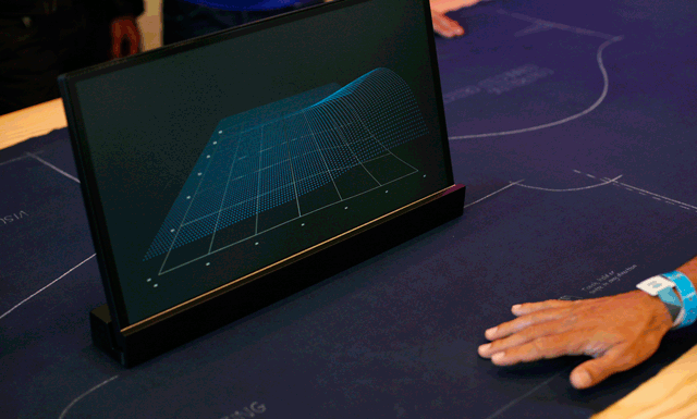
This slide appears to show the back cameras on Qualcomm and Google's Project Tango phone
You might recall that Project Tango covers smartphones and tablets using special cameras, sensors and software in order to map out a "3D model of the space around you." The special hardware takes a quarter of a million 3D measurements each second, and updates that data in real time.
Qualcomm has just announced that it and Google are working together on a new Project Tango handset that will be powered by the Snapdragon 810 chipset. That includes an octa-core CPU and the Adreno 430 GPU. The phone is not going to be made available to the public as it will be offered only to developers and device manufacturers. It essentially is Qualcomm's reference phone design with Project Tango capabilities built in.
Yesterday, Google announced at I/O that the Project Tango developer kit tablet will go on sale next week at a price of $512. It will be available from the Google Play Store for everyone, and will contain the NVIDIA Tegra K1 chipset inside. This is the same tablet that launched earlier this year for developers, priced at exactly twice what Google is asking for now. It includes a 7-inch screen with 1080 x 1920 resolution, 4GB of RAM and 128GB of native storage. Two cameras are included along with a depth sensor. The slate supports Wi-Fi, Bluetooth LE and 4G LTE connectivity.
Project Tango originally came from Motorola's Advanced Technology and Projects group, the same team behind Project Ara. When Google sold Motorola to Lenovo, Google kept the group instead of turning it over. Things like 3D mapping and modular phones are more suited to a company like Google as the tech titan is more likely than Lenovo to be able to put Project Tango on a commercial phone.
Google's Project Abacus aims to replace password-based authentication systems
Yesterday at the Google I/O conference, Google showed off a number of new features that are going to debut on Android M, such as a new power-saving mode, improved RAM management, support for fingerprint readers, or granular app permissions. Today, Google employees returned to the stage to introduce more futuristic tech developed by the ATAP team, such as smart clothing, a working version of Project Ara, and Project Abacus. The last one, Project Abacus, is a smart authentication system that aims to eliminate the password in future mobile devices.
Project Abacus does its magic by analyzing usage patterns. It looks at things such as the way you type, the way you move, the way you swype, and the apps that you usually use. On top of that, Abacus also uses biometric authentication tools such as voice and face detection. By combining all of those signals, the system tries to identify if the person currently using the device is actually the owner.
The trick here is getting all of these things to work together. While face detection can be easily fooled (at least for the moment), it's hard for a potential perpetrator to also mimic your voice and the way you use a device. Google says that Project Abacus is actually harder to fool than conventional authentication systems such as 4-digit passwords or fingerprint readers.
However, since the device is constantly collecting and analyzing all sorts of data, battery life is likely to take a hit, but hopefully Google will find a way to optimize power consumption.
Today in a live demo on the Google I/O stage, Project Abacus was able to tell the difference between two separate users. Looking into the future, the system might actually go through some safety protocols when it detects that the device is not being used by its owner. At the moment, Google's ATAP team has yet to disclose when Project Abacus might make its way to commercial devices.
Google overhauls Android Design website – more guides and articles to tell you what it's all about
Material Design is still a fairly fresh concept. Introduced last year, with Android Lollipop, the design language strives to offer a simple, “flat” user interface, which employs shadows and colorful elements in ways that aim to help us intuitively “get” the functions of the app that is presently loaded up on-screen.
Google seems pretty proud of the concept and has, more than once, expressed its desire that app developers and partners follow the language for their own products, making the Androidverse a seamless one for users to surf through. In order to help software makers, Google put up a set of design guidelines and a website – called Google Design – which was to provide the information needed for developers to create apps that look “natively” Android 5.
Well, let's be honest – the last few months have been a bit hectic, and while some “Material Design” apps really look good, others seemed to fall short. Obviously, the point and ideology behind the framework was still not going across. We suppose that is why Google has now updated the Google Design web site with a lot more information, articles, and even videos, which aim to inform anyone interested on what the Material look is all about.
Still feeling confused? Check out the videos below and get the answers you've been looking for.
Android M: all 55 new features explained (full changelog)
The Android M Developer Preview is now available for download for devs to start optimizing their apps to make them fully ready for launch when Android M launches on retail devices at the end of Q3 2015, and while we're all busy flashing the build to our Nexus devices, we noticed Google gives a very detailed break-down of all the new features in Android M.
Apart from the 6 key improvements in Android M - app permissions, web experience, app links, mobile payments, fingerprint support, and power and charging - there is a lot of interesting stuff that Google just couldn't show at the event, or it would have become a marathon for the viewers.
This, however, shouldn't stop us from looking and trying to decipher all the novelty in Android M starting with what Google itself has highlighted as important new features. We counted a total of 55 new features, and we plan on trying to understand each one of them, starting with the most important ones. Let's go.
Major new Android M features
Direct Share
It was already easy to share content between apps on Android but with Direct Share, Android can now learn which apps you share content to frequently and place that at the top of the list, so if you share photos to the Facebook app a lot, it will be at the top. Direct Share also lets you share content to specific people that you contact you the most, so they are placed directly in the share sheet instead of having to hunt them in the contacts list.
Improved text selection and floating toolbar
The text selection in Android hasn't changed much in several years. You still get the same confusing, nondescript icons at the top when you select the text in an app. With M, you now get a floating toolbar with clear cut, copy, and paste buttons, with overflow menu for additional options such as search or translate. The selection now also moves forward word by word instead of letters to make it easier to mark text but you can go back to select letter by letter. This feature is not present in the current developer preview for some reason.
There will also be undo/redo keyboard shortcut buttons.
App Standby
We talked about Doze, which puts the device in a deep sleep state when not used for long periods of time to save power. App Standby does this for individual apps. When the OS detects an app hasn't been used in a long period of time then it automatically puts it on standby, which disables its network access and suspends its syncs and jobs. When you plug in your device for charging, these apps can resume syncing in the background as usual.
Improved volume control
A lot of people were upset by the lack of a traditional Silent mode in Lollipop. With M, the silent mode is back, accessed by holding down the volume button and then once again to exit the vibrate mode. Only alarms work in the Silent mode, as they used to.
Google also brought back the extended volume control options, which let you control the media and alarm volumes by a drop down next to the ringtone volume level. The Interruptions feature has been removed from the volume bar and now is a separate feature listed below.
Do not disturb quick setting
M has a new Do not disturb button in the notifications, which is essentially the previous Interruptions feature. You can choose between Total silence mode, Alarms only mode, or Priority only mode. You can customize these options from the notifications or the Settings app.
Adoptable storage devices
Users can now add an SD card, which will then be adopted by the system to behave like internal storage. The memory card will be formatted and encrypted and will be seen like internal memory. You can then install apps and other private data easily onto the memory card.
Auto backup for apps
Google will now perform full automatic data backup and restore for apps designed for M. The data will be in your Google account and will be synced across devices.
Bluetooth stylus support
The OS now includes improved support for Bluetooth stylus devices.
Improved Bluetooth Low Energy Scanning
A new approach to scanning method cuts down on the power required to perform the scan, provided the developer of the app implements the feature.
Hotspot 2.0 Release 1 support
Support for Hotspot 2.0 in devices like Nexus 6 and Nexus 9 to automatically connect to Hotspot 2.0 networks when you enter the area.
4K Display Mode
Android M now supports display resolutions up to 4K.
Improved Android for Work
Includes features such as enhanced controls for Corporate-Owned, Single-Use devices, silent install and uninstall of apps by Device Owner, silent enterprise certificate access, auto-acceptance of system updates, delegated certificate installation, enterprise factory reset protection, data usage tracking, runtime permission management, VPN in Settings, and work status notification.
Improved USB On-The-Go support
Previously connecting a USB OTG drive in stock Android made it accessible in apps but the OS itself behaved as if nothing was connected. In M, you now get a notification that lets you explore the contents of the drive in a file explorer like interface, along with an eject button to safely remove it. It also shows up in the Storage option in the Settings app, which has been revamped slightly.
Improved Calculator app
Google added a few extra functions to the Calculator app, namely the ability to switch between radians and degree and inverse sine, cosine and tangent functions. But there is still no percentage button.
5GHz hotspot access point band
M now allows you to setup your phone's hotspot on the far less crowded 5GHz band on compatible devices.
Changes to UI
M brings a handful of changes to the UI. First thing you'll notice is the new app drawer, which lists apps alphabetically in a vertically scrolling grid and shows most used apps at the top. There is a search button at the top as well. Even the widgets drawer has a vertically scrolling design.
The lockscreen also gets a different font for the clock and the voice search button replaces the dialler in the bottom left corner.
Google got rid of the Google Settings app and now all the options are listed inside the main Settings app under an option called Google.
Swiping up from the Home button bring the new Google Now on tap UI with a new animation. Now on tap is not yet available even in the developer preview but you can still use the Google Search bar which is available at the top.
The animations in general on M are more dramatic. There are some new animations for interactions and all the UI elements pop in and out with greater flourish. If you didn't like the animations in Lollipop, you are probably not going to like this either.
There is now an option to switch to the dark theme, although it's strangely buried in the Developer options in the developer preview. It also only affects the look of the Settings app for now. Other than Light, and Dark, there is an Automatic mode that automatically switches it to dark mode at night but it would have been nicer if it changed depending upon the ambient light.
That's it for now. We will be digging further in the developer preview to find more interesting things. It's worth noting that a lot could change in the final version. Some things might be removed, others added. This is the very first build that Google released and it's meant more for developers than users, so take all the UI changes bits with a grain of salt.
As for the developer preview, it's a beta and like all betas, not recommended for daily use. Many of the apps are crashing and there are other oddities as well (the phone memory doesn't show up on the computer when connected over USB for some reason). It's for this reason we don't recommend you install it on your primary device, but if you have a device to spare, you could give it a shot and send in any interesting things you find.
Important new Android M features
Data Usage API for work profiles
Bluetooth SAP
Voice interaction service
App link verification
Text selection actions
Unified app settings view
Corporate owned single use device support
Improved trusted face reliability
New runtime permissions
Google Now Launcher app suggestions
5GHz portable Wi-Fi hotspot
Seven additional languages
Less important new Android M features
Work contacts in personal contexts
Hotspot 2.0
VPN apps in settings
Duplex Printing
Seamless certificate installation for Enterprise
Undo/Redo keyboard shortcuts
Do Not Disturb automatic rules
Material design support library
Android Pay
USB Type C charging
Battery historian v2
BT 4.2
Improved bluetooth low-energy scanning
Improved text hyphenation & justification
Improved diagnostics in systrace
IT admin acceptance of OTAs
Chrome custom tabs
UI Toolkit
Enterprise factory reset protection
Do not disturb quick settings and repeat caller prioritization
Finally: Hidden Android M feature allows customization of quick toggles
One of Android's core strengths is its open nature — any developer can build on top of it, and many do. Given the platform's scale, it's unsurprising that this has spawned a number of communities that focus on modding the system in order to gain extended functionality. For years now, we've called modded Android software custom ROMs, though not all mods and hacks require you to flash an entirely new firmware. The byproduct of this activity is obvious if you step back — Google has a legion of (unpaid) developers contributing to Android, and a free pick of the features it likes best.
Over the years, third-party devs' efforts have translated into functionality that, eventually, becomes available with stock — or Google's — Android. In Android M, we already saw yet another great piece making the transition from a third-party perk to a core feature — granular volume controls bar. After some digging, however, we found that another often-requested feature may very well become a part of the core Android experience: customizable quick toggles.
In case you drew a blank at the mention of quick toggles, they're simply the shortcuts available when within the notifications panel that you slide from the top. There, you have access to brightness control, Bluetooth, Wi-Fi, and so on. Until now, it's never been possible to re-arrange or change these. In Android M, however, this may change, judging by a new feature available within the hidden (by default) Developers options menu. In there, you can find a SystemUI tuner option, which if enabled, spawns a menu of the same name in the root settings menu, as shown below.
For the time being, the option is quite buggy, and constantly causes the system UI to crash. Occasionally, however, it works properly, allowing us to change things around and even add a new, custom toggle. Due to the nature of developer previews, it is possible that this feature never makes it into the final, commercial software, so keep that in mind. If it does, however, Google will give many an additional reason to love stock Android.
终于看完了 Android M
App Permissions - 这个对我个人来说还没有很重要,不过的确达到很多security的部分
Web Experience - 不是很明白那个Pinterest的例子。后面有些部分之前Chrome好像都可以做到了的虽然有增加一些其他的同步功能
App Links - 其实这个跟现在的也没有很大差别吧,好像该链接是FB的,你第一次按的话会给你选可以用FB来打开还是游览器来打开。过后你选了哪一个是默认的就可以了啊。还是这次它直接skip掉这个部分而已?!
Mobile Payment - 这个好几年都有了但一直都热不起来,加上在我们这里流行起来也真的不懂等到什么时候。不过的确是很方便的
Fingerprint Support - 没有什么意见,前提是先要有硬件支持虽然也是很方便
Power & Charging - Doze,很不错,觉得跟Greenify类似吧。这样可以延长standby时间。 USB Type-C,觉得那张图片就是LG代工的手机?!可以用手机来办其他仪器充电,很不错,多多少少都有帮助到。
Easy Word Selection and Floating clipboard toolbar - highlight word by word不错也比较容易,但那个所谓toolbar之前没有的吗?
Direct Share - 很好,很方便。省了几个步骤和时间
Simplified Volume Control - 回去以前的样子可以调其他的声量


 本周最热论坛帖子


 发表于 29-5-2015 10:40 AM
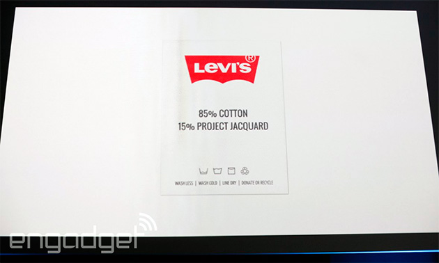
 变色卡
变色卡 千斤顶
千斤顶 楼主
楼主


 。加上现在的人拍照还多过吃饭和喝水
 3166
3166  91
91